AngelHub is an angel investment platform for professional investors based in Hong Kong. The company focuses on investments in four main industries: Web3, Fintech, ESG and Industry4.0.
For its rebranding, the main objective was to make the company look and feel younger and more approachable.
"Our brand should be as dynamic and exciting as the investment opportunities we offer."
After an initial brief meeting with stakeholders, I developed a competitor analysis documentation and moodboard research. From those efforts, a set of four different visual routes were developed. The original logo was also tweaked for better legibility (especially at smaller scales).


Visual treament: experiment #1

Visual treatment: experiment #2

Visual treatment: experiment #3

Visual treatment: experiment #4
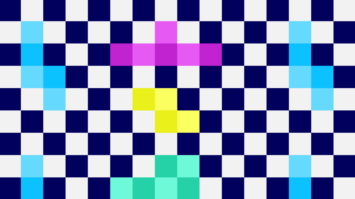
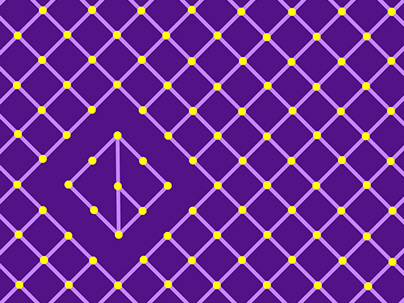
Route 1 was chosen due to its flexibility. Almost any icon can be built from the pixel treatment developed in this approach. It also opens up a universe of possibilities, both graphically and conceptually.
From a conceptual point of view, the pixel is very meaningful for AngelHub. The company mainly invests in technology, and the pixel is a symbol of continuity. No matter how advanced technology gets, it will always be composed of its primitive elements (such as the pixel, for screens). The pixel is an atom in the digital universe.
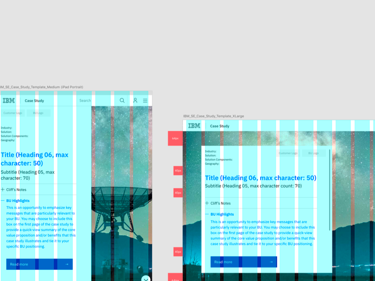
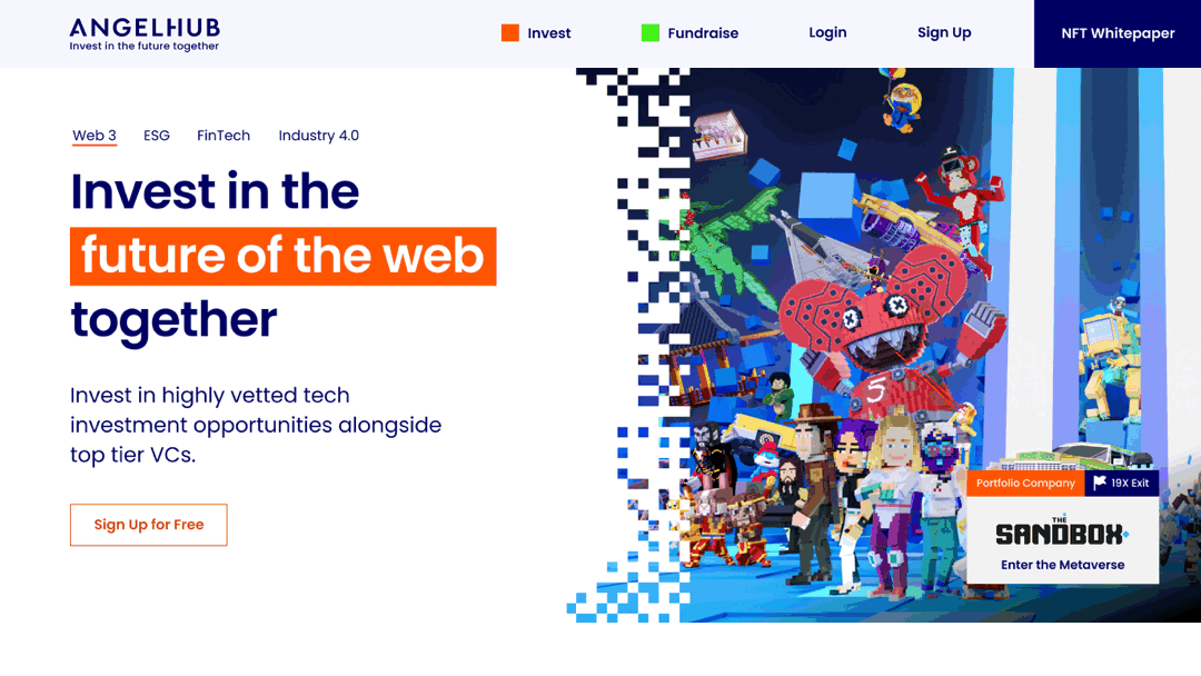
Final website
Currently under development
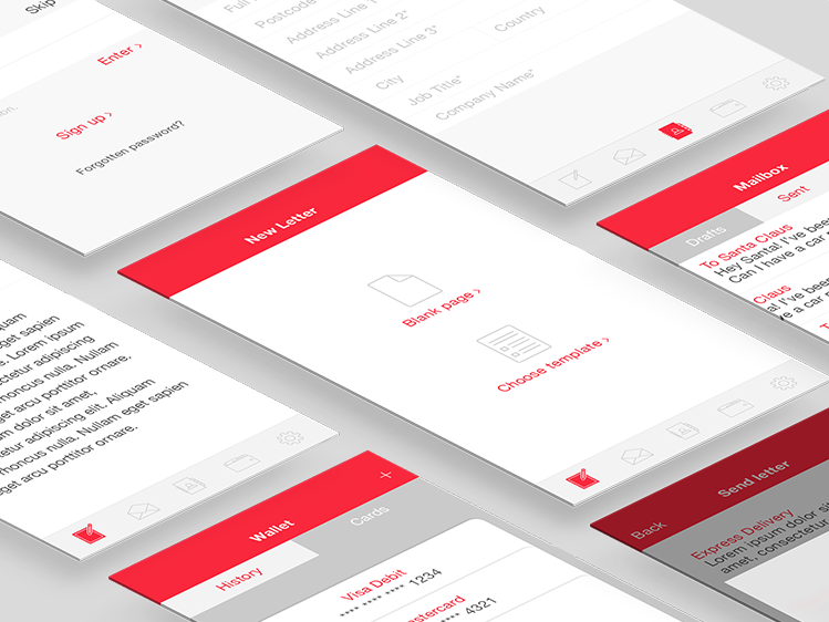
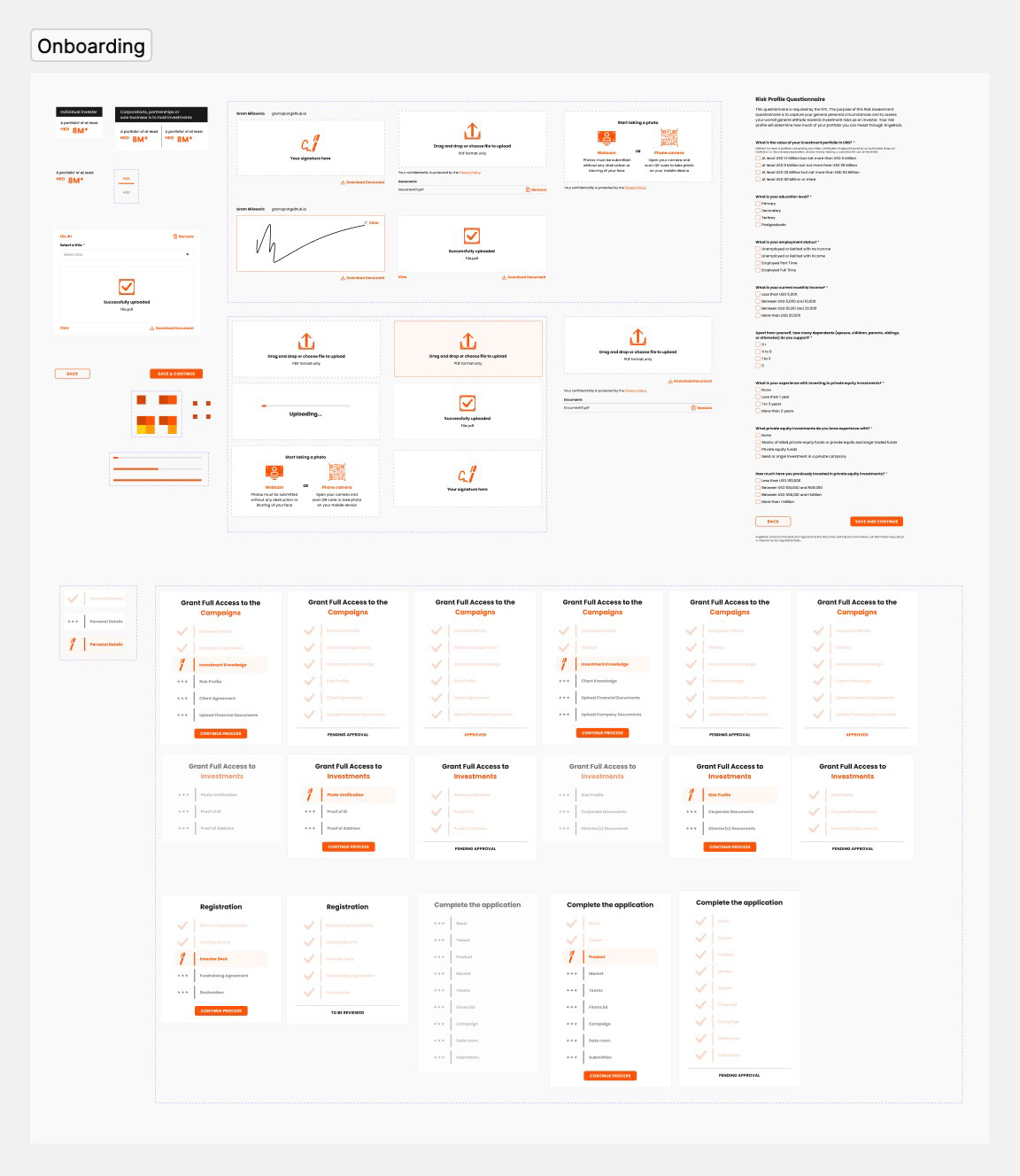
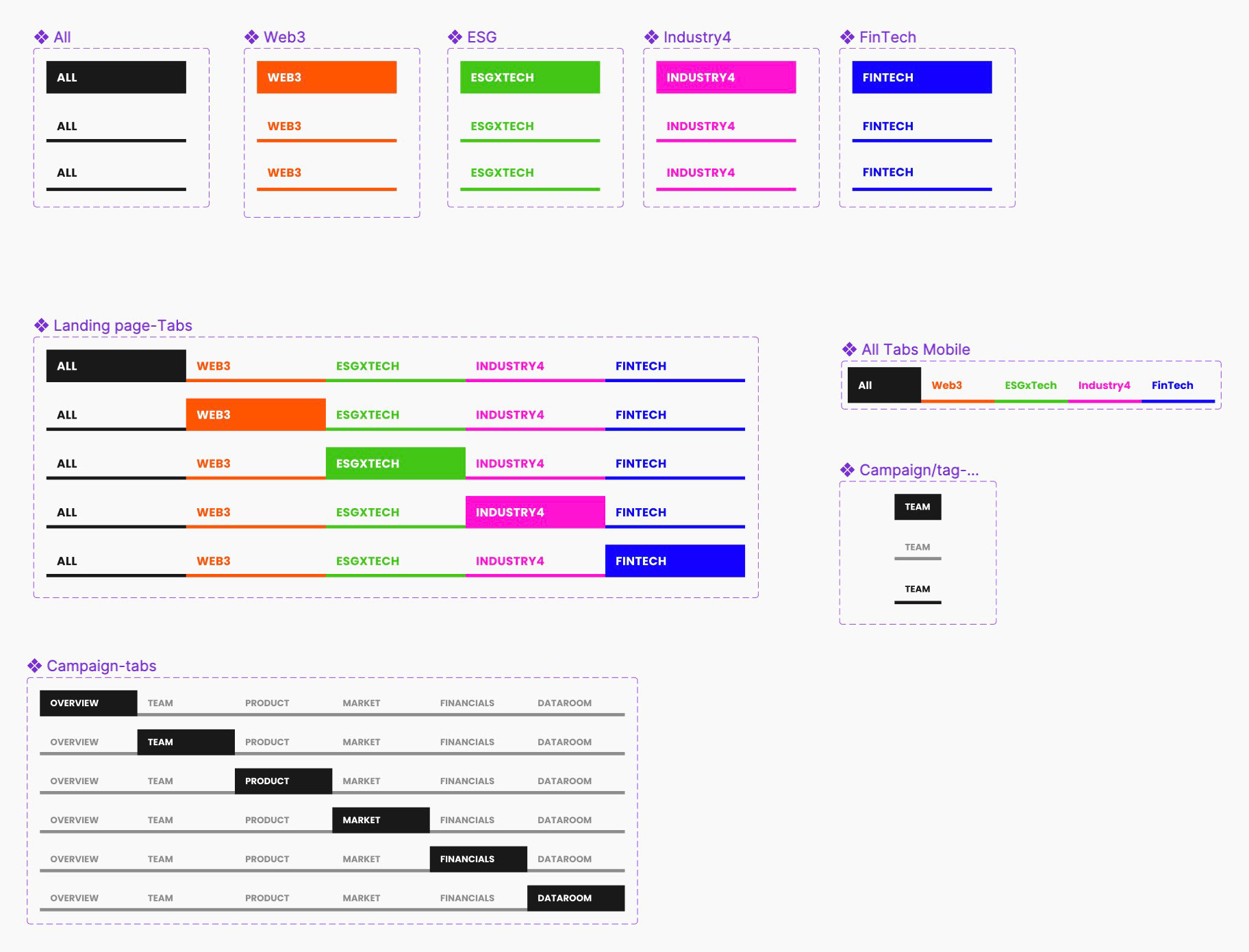
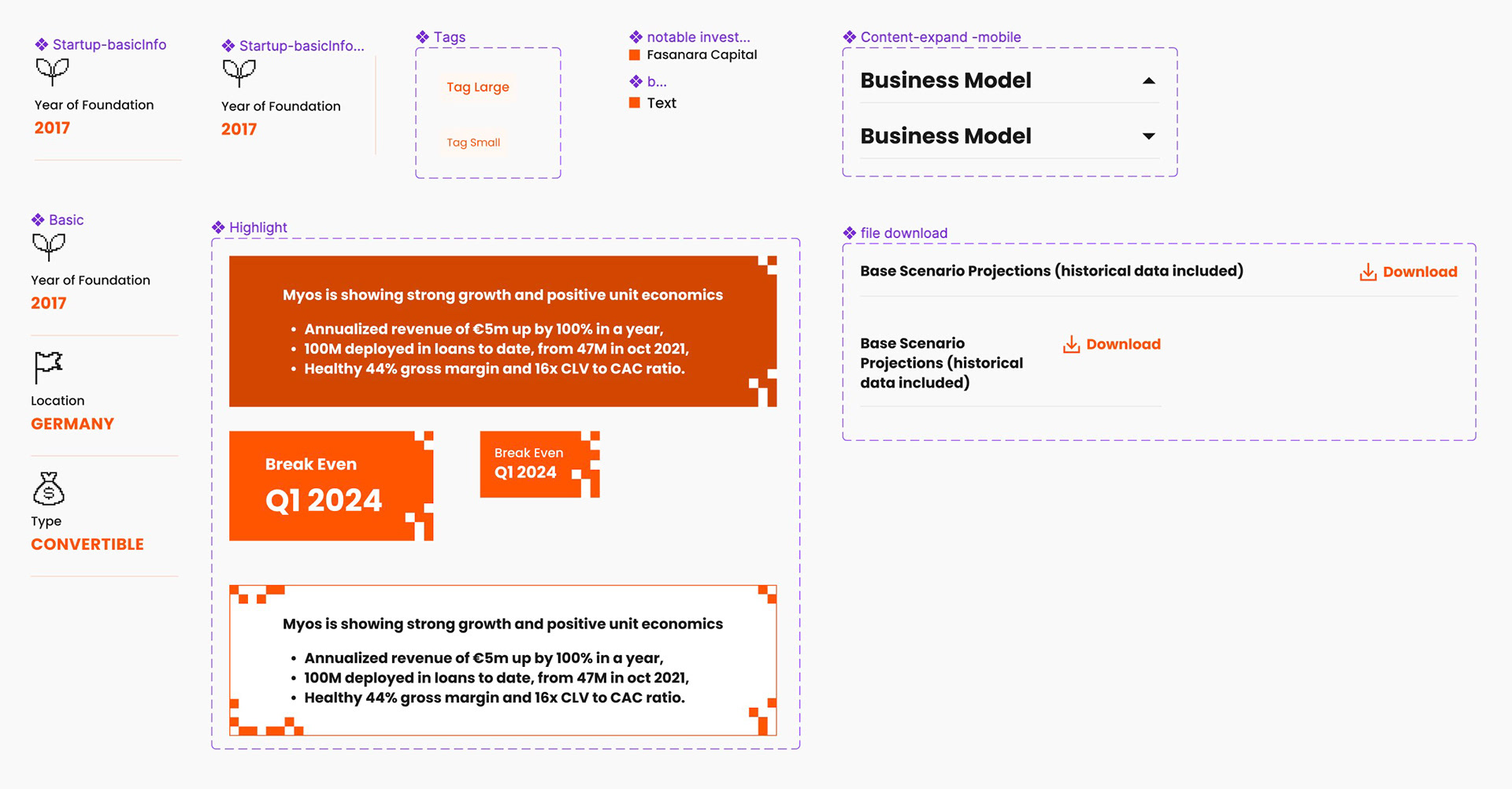
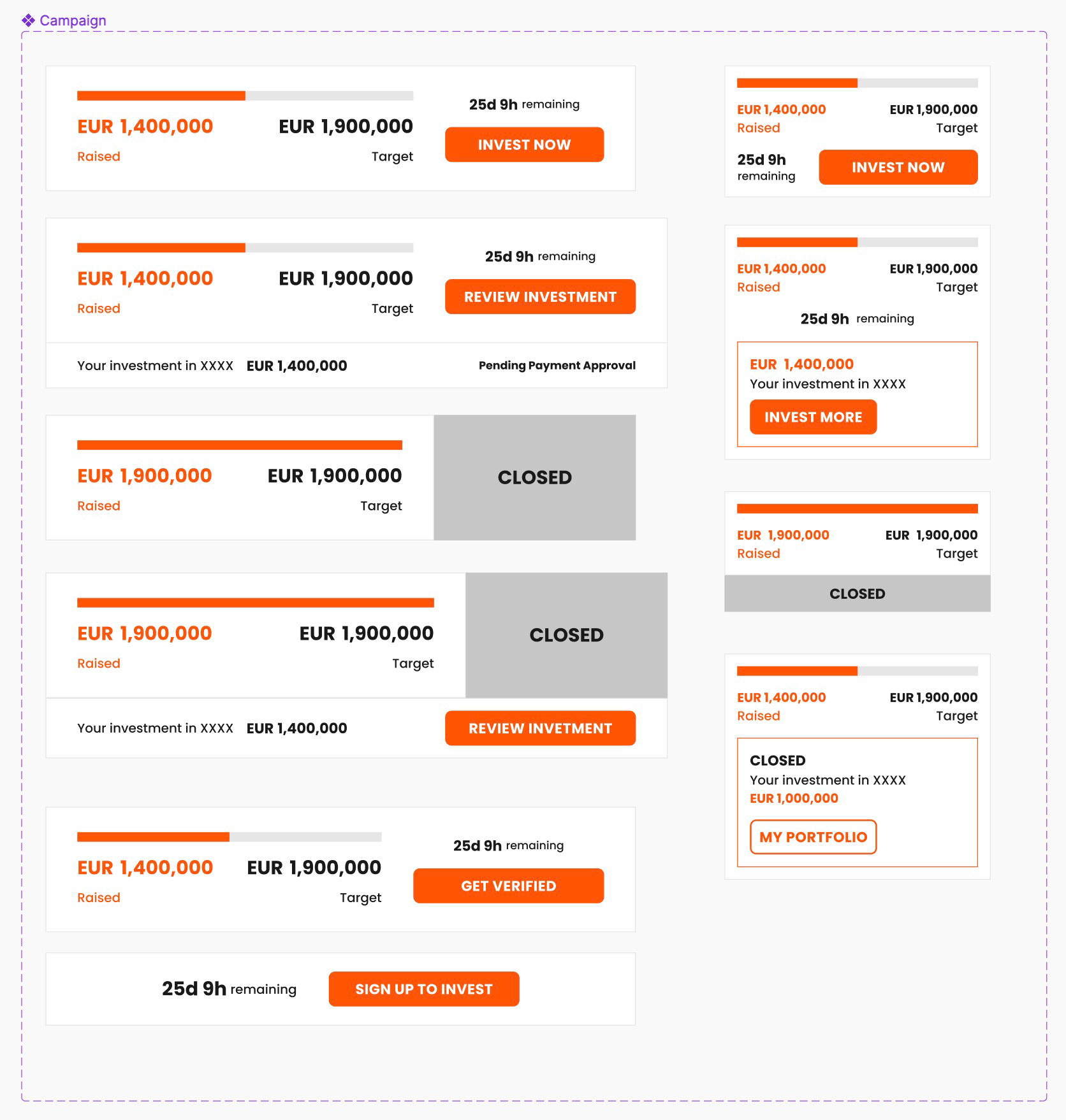
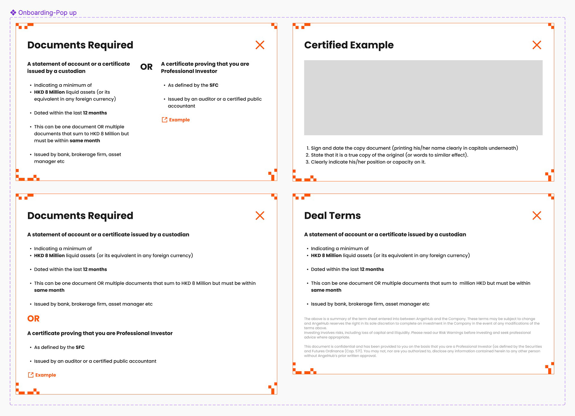
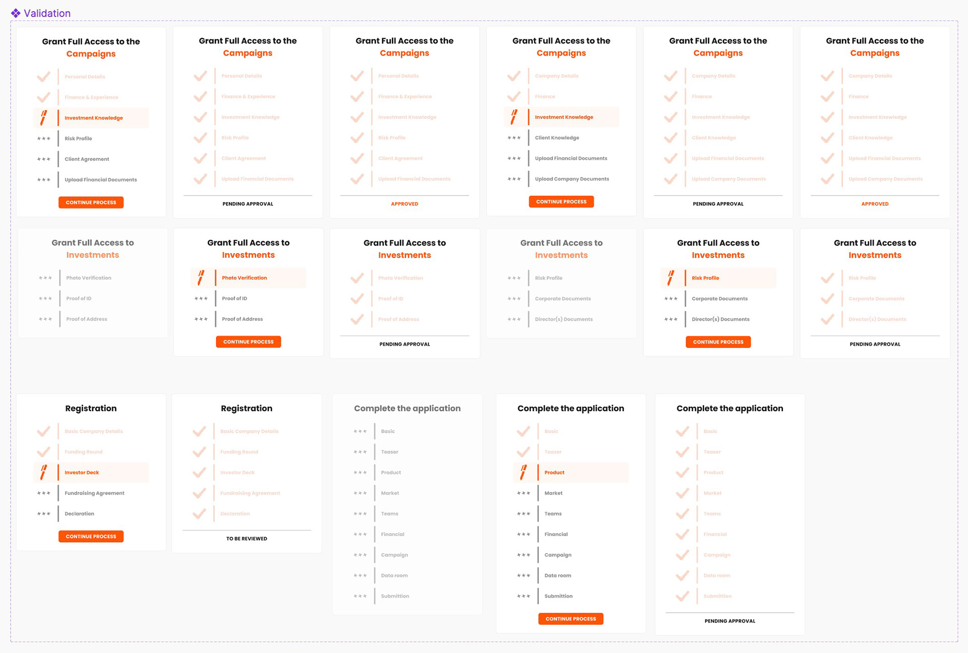
Website (UI components)


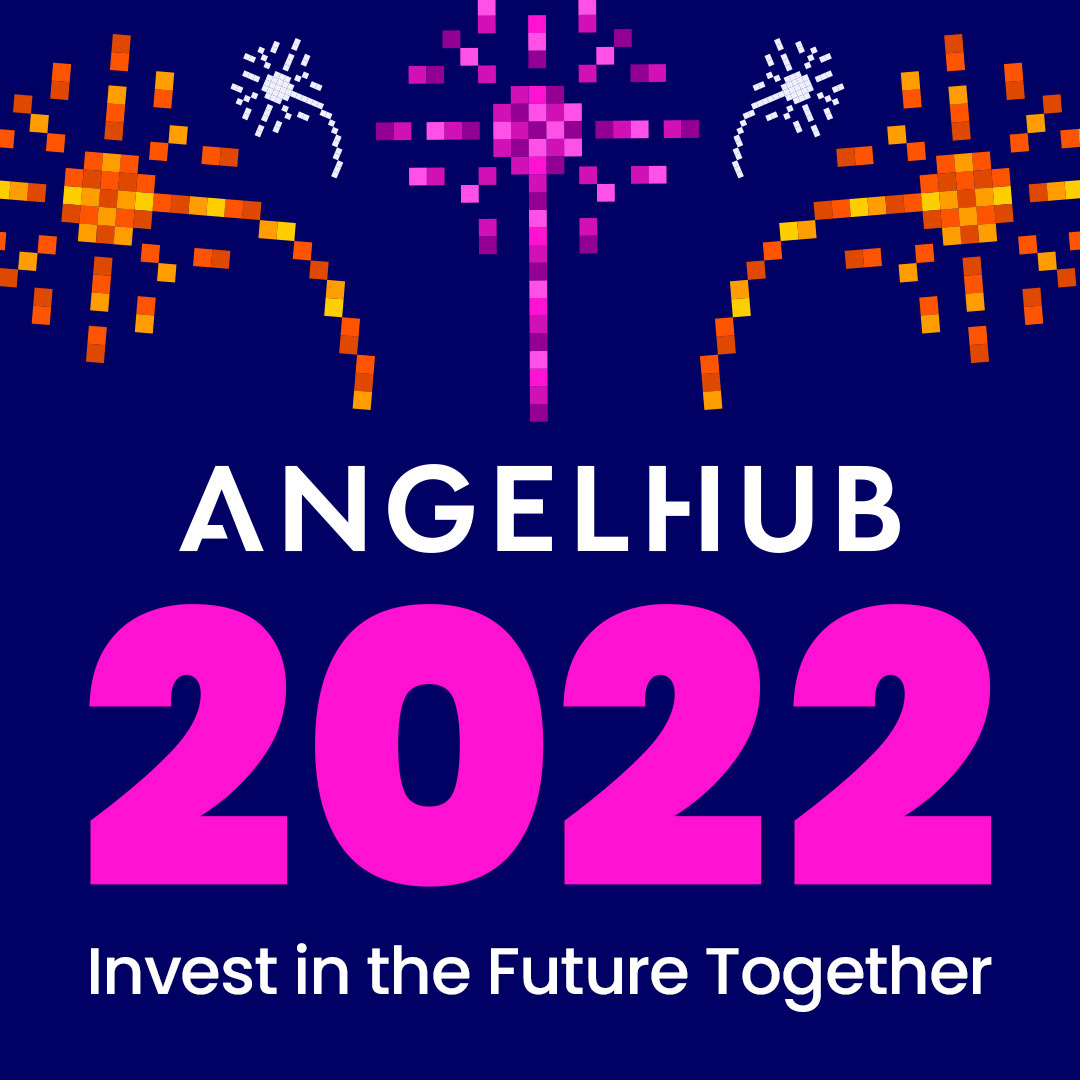
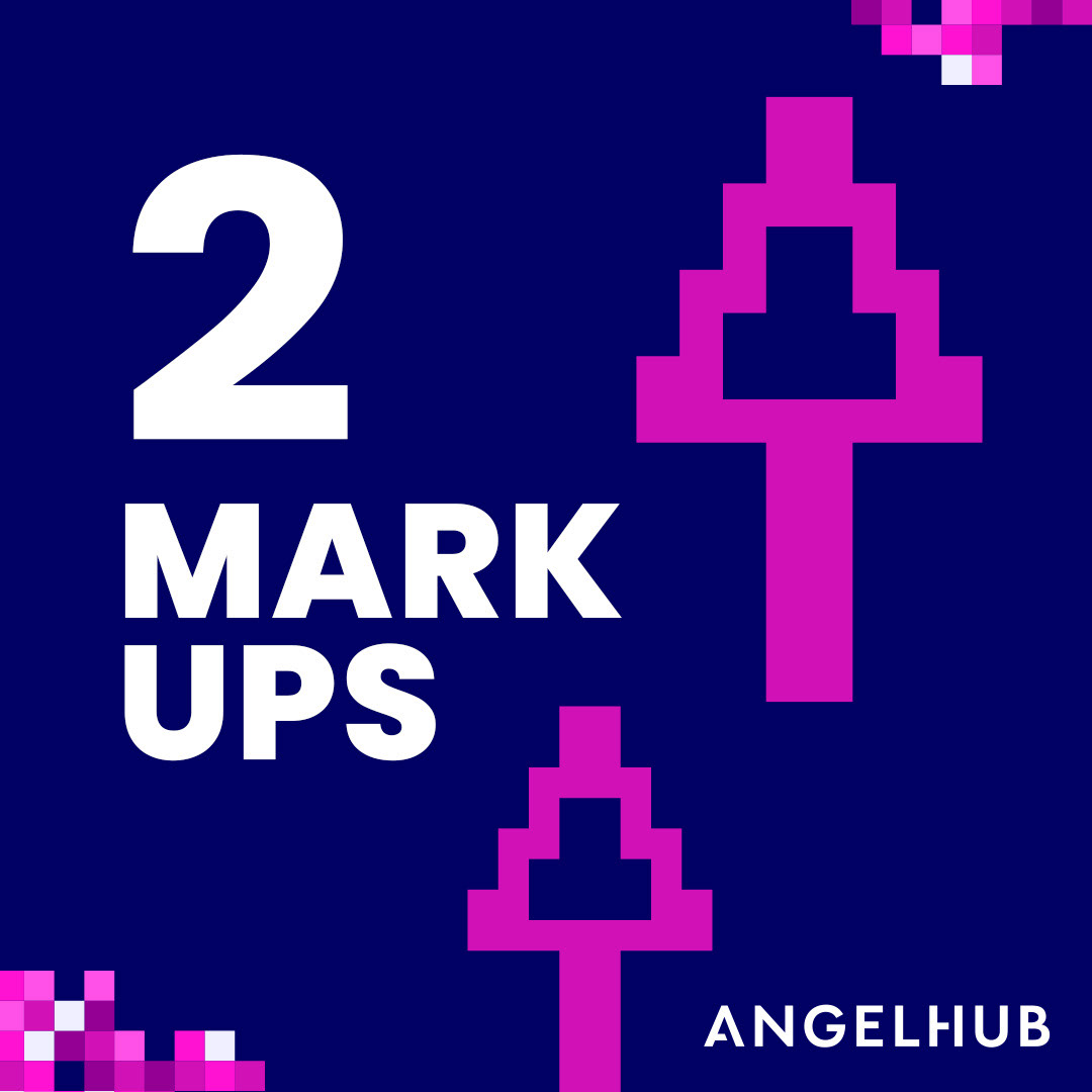
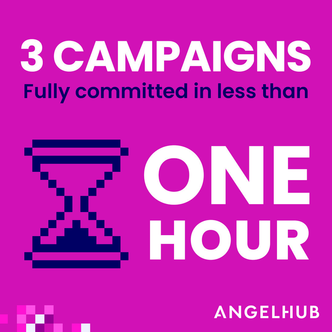
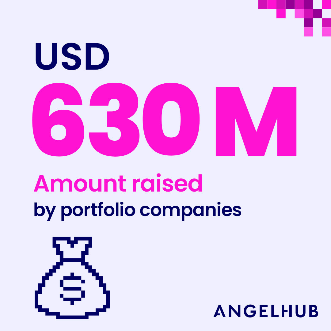
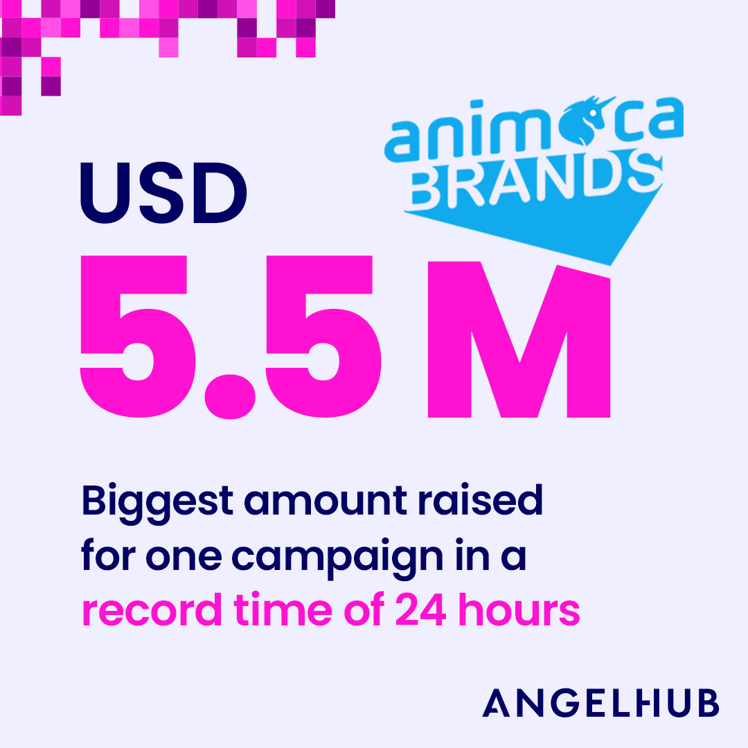
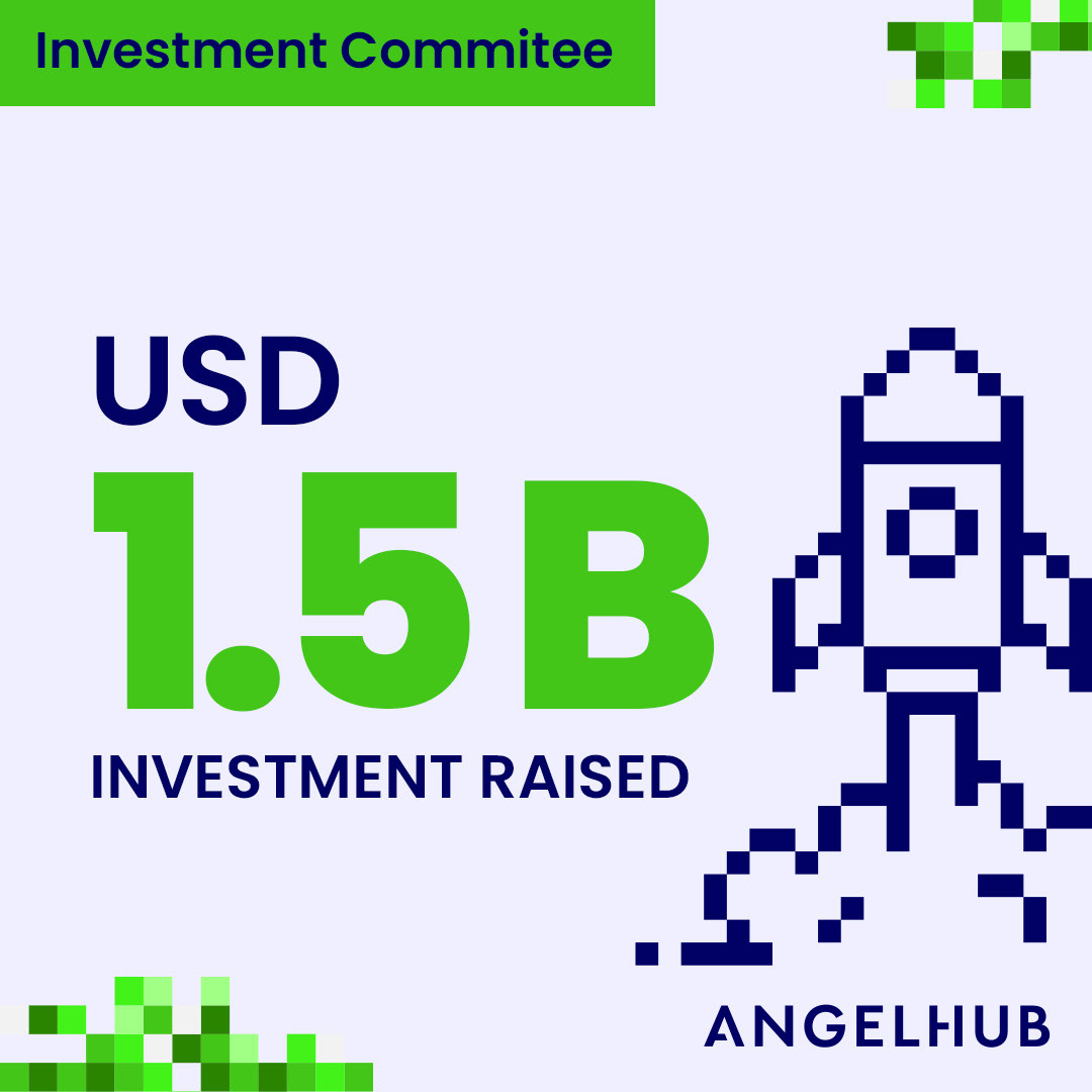
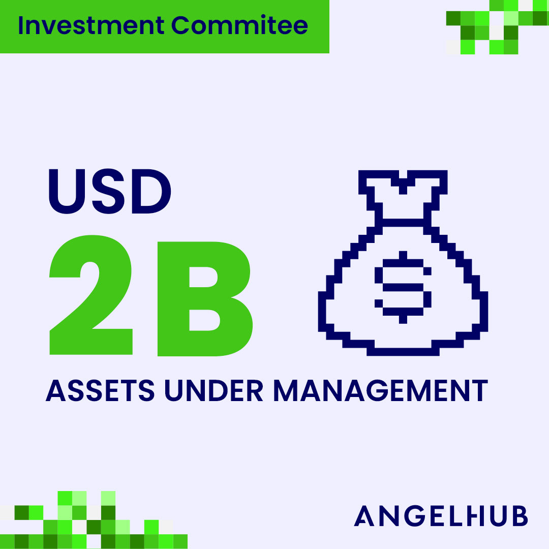
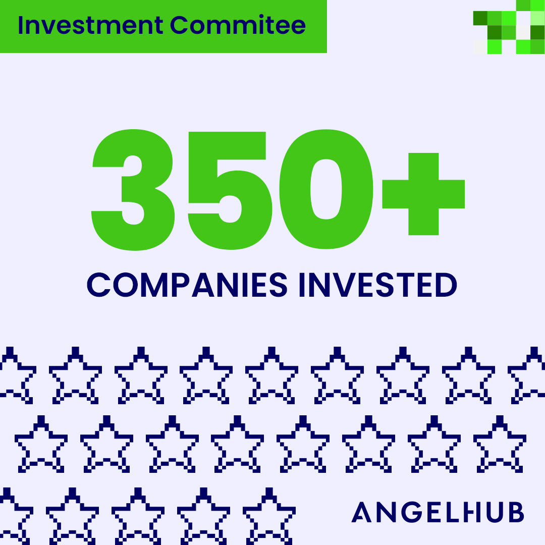
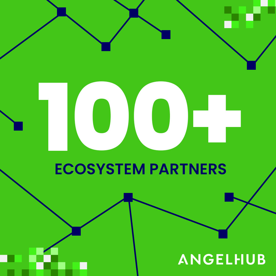
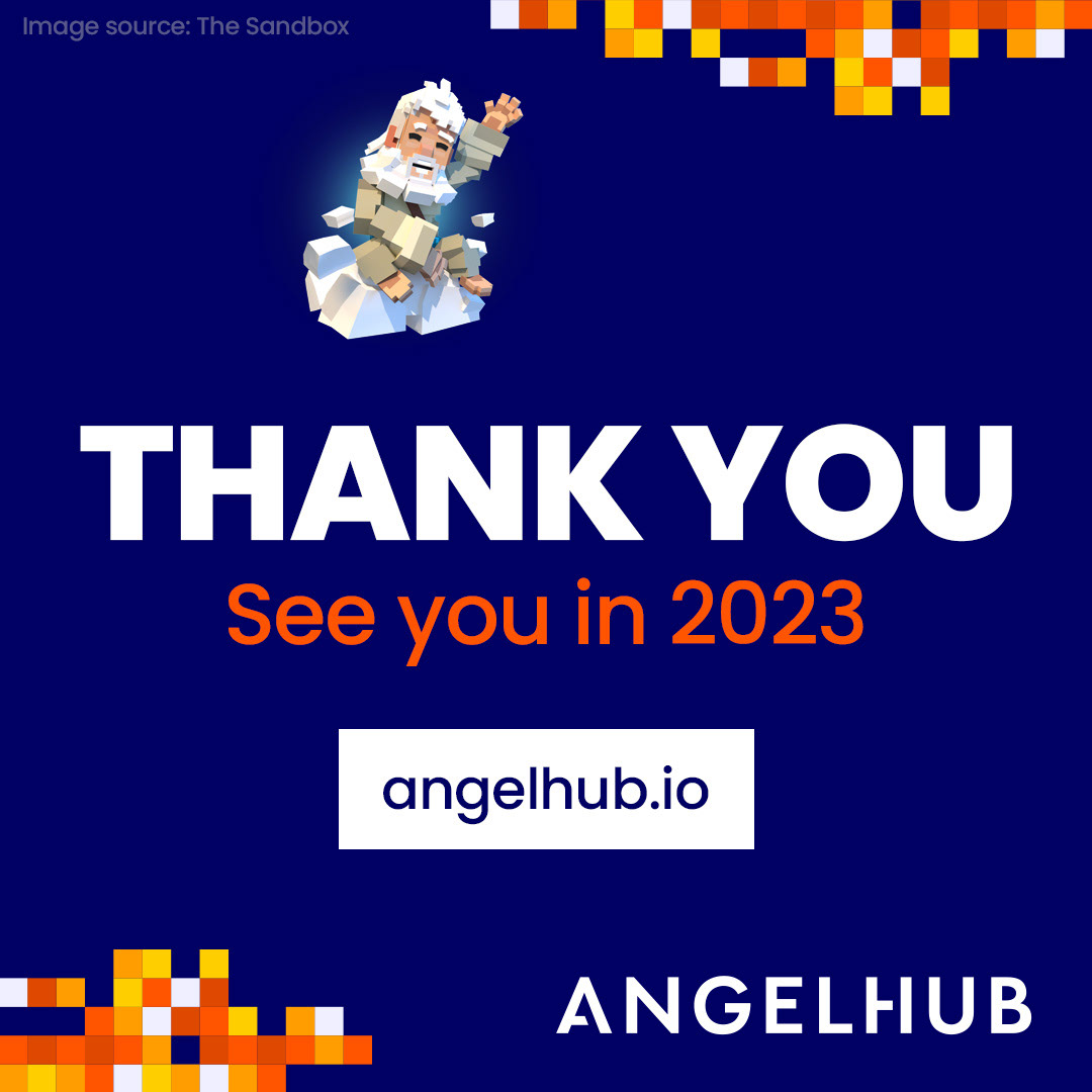
AngelHub promotes heavily on social media. Any updates from its company portfolios, industry news or events goes through the main communication channels. Recently, I have designed a series of Instagram/Linkedin carousels (2022 retrospective) that performed exceptionally well. They were split into three different posts (Company Highlights, Events and Network Achievements), each using a specific brand colour. You can see some of the frames below.
Social Media (Instagram)